2024 Room Color Palette Designer
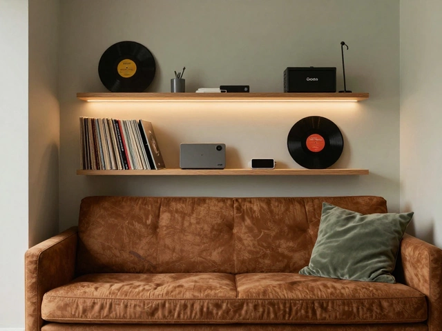
Use the 60-30-10 Rule: 60% Dominant Neutral, 30% Secondary Color, and 10% Accent Pop. Select a vibe below to see how to balance your room.
1. Choose Your Room Vibe
2. Your Color Application Guide
Application Strategy:
- Walls: Use the Dominant color for a seamless feel.
- Furniture: Use the Secondary color for large pieces (sofa/rug).
- Details: Use the Accent color for pillows, art, or a single chair.
💡 Pro Tip:
Avoid clinical vibes by choosing "off-whites" with yellow undertones for your 60% base.
Quick Takeaways for Your Palette
- Warm Neutrals: Replacing cold grays with buttery creams and sandy beiges.
- Earth Tones: Terracotta, moss green, and deep ochre are bringing the outdoors inside.
- Moody Maximalism: Darker hues like charcoal and midnight blue for a cozy, cinematic feel.
- Pastel Pops: Soft peaches and mints used as accents to keep spaces feeling light.
The Shift Toward Warmth and Comfort
For years, the 'millennial gray' dominated every flip-house and modern apartment. But in 2024, the pendulum swung back. People are craving warmth. We are seeing a massive rise in Warm Neutrals is a category of interior colors including cream, beige, and taupe that create a cozy, inviting atmosphere. Think of it as the difference between a cold office and a soft cashmere sweater.
Instead of a stark white, designers are opting for "off-whites" with yellow or red undertones. This change makes a room feel lived-in rather than staged. For example, a living room painted in a soft buttermilk shade feels significantly more welcoming under evening lamp light than a bright optic white, which can feel clinical. This trend is all about psychological safety-creating a sanctuary where you can actually relax.
Bringing the Outside In with Earth Tones
Nature isn't just for the backyard anymore. The 2024 trend heavily leans on Biophilic Design is an architectural and interior design approach that seeks to connect building occupants more closely to nature. This translates directly into the colors we use on our walls and furniture.
Sage greens and deep forest hues are leading the charge. These aren't just "green paints"; they are tools to lower stress. A study on environmental psychology suggests that surrounding yourself with nature-mimicking colors can lower heart rates and improve focus. If you have a home office, a muted olive green wall can actually help you stay calm during a stressful Zoom call. Pair these with Terracotta, which adds a grounded, organic feel that reminds us of Mediterranean villas and ancient pottery.
| Color Family | Emotional Impact | Best Room For | Suggested Pairing |
|---|---|---|---|
| Warm Neutrals | Calm, Cozy | Bedrooms, Living Rooms | Light Oak Wood |
| Deep Greens | Focused, Renewing | Home Offices, Libraries | Brass Hardware |
| Rich Ochre/Gold | Energetic, Optimistic | Kitchens, Dining Areas | Deep Navy Blue |
| Charcoal/Navy | Sophisticated, Intimate | Powder Rooms, Master Suites | Cognac Leather |
The Rise of Moody Maximalism
While some are going for light and airy, others are leaning into the dark side. Interior color trends 2024 have seen a surge in "moody maximalism." This is the art of using saturated, dark colors to create a cocoon-like effect. We are talking about midnight blues, deep plums, and charred blacks.
The trick here is contrast. If you paint a small powder room in a deep, matte navy, the space doesn't feel smaller-it feels more intentional and expensive. This approach works best when you use Saturated Hues is colors with high intensity and purity, avoiding a washed-out or greyish look. To prevent the room from feeling like a cave, add metallic accents like gold or silver lamps and mirrors. These reflect light and break up the darkness, adding a layer of luxury that a plain white wall simply cannot achieve.
Soft Pastels as a Breath of Fresh Air
If dark colors feel too heavy and neutrals feel too boring, 2024 offers a middle ground: the "new pastels." We aren't talking about baby blue nurseries. We are talking about sophisticated, dusty versions of peach, mint, and lilac.
The standout here is Peach Fuzz, which focuses on nurturing and warmth. These colors work beautifully as accent walls or in the form of velvet upholstery. Imagine a dusty rose armchair against a sage green wall-it creates a visual balance that is playful yet mature. The key is to avoid overdoing it. Use a 60-30-10 rule: 60% dominant neutral, 30% secondary color (like your sage green), and 10% accent pop (like that peach armchair). This keeps the room from looking like a candy store.
How to Choose the Right Color for Your Space
You can't just pick a color because it looks good on Pinterest. You have to look at your Lighting Conditions is the way natural and artificial light interacts with surfaces, affecting how a color is perceived. A color that looks like a soft cream in a bright studio might look like a dingy yellow in a north-facing room with little sunlight.
Before you commit to a full gallon of paint, always test a swatch on a large piece of cardboard. Move it around the room throughout the day. Check it at 10 AM when the sun is high, and again at 8 PM under your LED bulbs. You'll be surprised how a "neutral gray" can suddenly look purple under certain lights. Also, consider the scale of the room. While dark colors add intimacy to small spaces, they can make a massive, open-concept living area feel oppressive if not balanced with lighter furniture or rugs.
Common Pitfalls to Avoid When Updating Colors
One of the biggest mistakes people make is forgetting the "fifth wall"-the ceiling. In 2024, we are seeing a trend where the ceiling is painted a complementary shade of the walls rather than a flat white. Painting the ceiling a soft cream or a very light version of the wall color makes the room feel seamless and cohesive.
Another trap is ignoring the undertones. Every paint has a base-either cool (blue/green) or warm (yellow/red). If you pair a cool-toned gray sofa with a warm-toned beige wall, they will often clash, making the wall look dirty or the sofa look too blue. Stick to one temperature for your primary colors to ensure the room feels harmonious.
Will 2024 color trends still be relevant in 2026?
Yes, because the current shift is based on a fundamental change in how we view home-moving from "show-homes" to "sanctuaries." Warm neutrals and earth tones are timeless choices that don't go out of style as quickly as specific "trendy" neon or stark gray colors.
How do I incorporate dark colors without making my room feel small?
Use the "color drenching" technique where you paint the trim and baseboards the same color as the walls. This removes the visual boundaries of the room, which can actually make the space feel larger and more cohesive. Also, incorporate mirrors and metallic accents to bounce light around.
What is the best color for a small, dark bedroom?
You have two choices: go light to maximize the little light you have (like a warm cream), or lean into the darkness with a deep, moody hue like charcoal. Often, trying to use a medium-tone gray in a dark room makes it look muddy; going very light or very dark is usually more successful.
Can I mix warm and cool tones in one room?
You can, but do it intentionally. Use one as the dominant tone (e.g., 80% warm neutrals) and the other as a sharp accent (e.g., a cool blue vase or pillow). If the ratio is 50/50, the room often feels visually conflicted and unsettled.
What are the best accent colors for 2024?
Terracotta, mustard yellow, and deep teal are the top choices. These provide a strong contrast to the popular warm neutrals and add a sense of personality and energy to a room without being overwhelming.
Next Steps for Your Home Makeover
If you are feeling overwhelmed, start small. You don't have to repaint your whole house in one weekend. Start with a "powder room" or a small hallway to test out a bold, moody color. If you prefer a safer bet, swap out your throw pillows and blankets for earth tones like moss green or ochre to see how they vibe with your existing furniture.
For those with high-traffic areas, consider the finish of your paint. A matte finish is great for those moody, deep colors as it hides wall imperfections, while a satin or semi-gloss is better for kitchens and bathrooms where you need to wipe away spills. Grab a few samples, tape them to your walls, and let the natural light do the talking before you make the final call.