2024 Neutral Palette Combiner
Create Your 2024 Decor Palette
Select your base neutral tone and discover complementary textures and accent colors based on current trends.
Your 2024 Palette
Recommended Textures
Accent Colors
If you’ve walked into a home lately and felt like everything just… clicked, you’ve seen 2024’s home decor in action. It’s not about bold statements or over-the-top trends. It’s quieter, calmer, and more thoughtful than ever before. The big shift? People are done chasing trends that look good in magazines but feel cold in real life. Instead, they’re building spaces that breathe, soothe, and work for how they actually live.
Neutral tones, but not boring
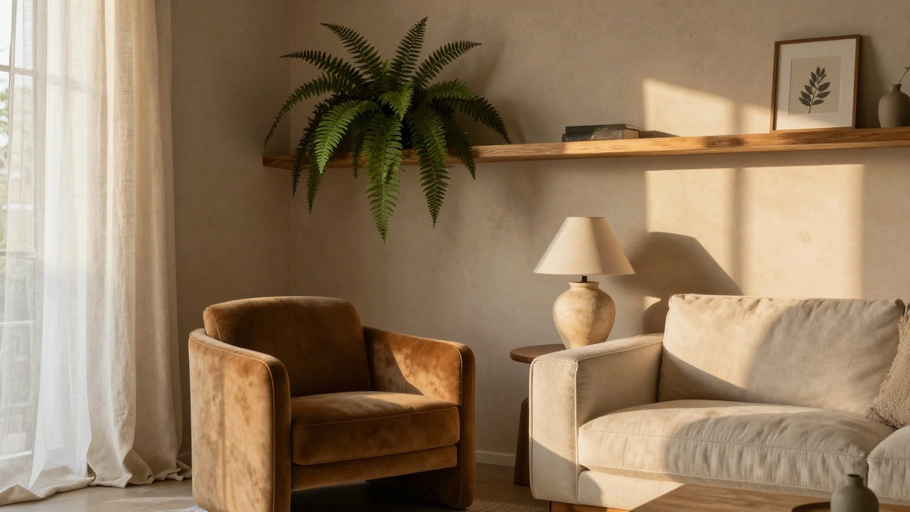
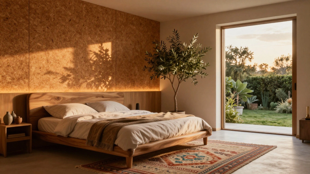
The era of stark white walls is over. In 2024, neutral doesn’t mean empty. It means layered. Think warm beiges, soft greys with a hint of olive, and creamy off-whites that change with the light. These aren’t paint chips from a 2010 catalog-they’re rich, earthy, and grounded. Paint brands like Farrow & Ball’s Setting Plaster and Benjamin Moore’s Revere Pewter are selling out because they don’t look flat under natural sunlight. The trick? Pair them with materials that add depth: linen curtains, raw wood shelves, and hand-thrown ceramic lamps. No one’s going for a monochrome look anymore. They’re going for texture that makes a room feel like a hug.
Biophilic design is no longer optional
Biophilic design isn’t just a buzzword anymore-it’s a requirement for mental comfort. In 2024, homes with indoor plants aren’t just trendy; they’re expected. But it’s not about a single snake plant in the corner. It’s about integrating nature into the structure. Think living walls in bathrooms, indoor water features in entryways, and large windows that frame trees like paintings. Even small homes in Sydney are installing vertical gardens made from recycled materials. The science is clear: people in spaces with natural elements report lower stress, better sleep, and higher focus. You don’t need a jungle. Just one or two intentional connections to the outdoors can transform how a space feels.
Textured walls are the new accent
Forget wallpaper. In 2024, walls are getting tactile. Clay plaster, lime wash, and cork panels are replacing flat paint as the go-to finish. These materials don’t just look different-they feel different. A wall covered in hand-applied clay plaster catches light in subtle waves, creating a quiet rhythm that changes throughout the day. It’s not about decoration. It’s about creating a sense of craftsmanship. You’ll find this in kitchens, bedrooms, and even home offices. Why? Because flat walls feel sterile. Textured walls feel alive. And in a world where screens dominate, people crave surfaces that remind them they’re in a physical, tactile world.
Curved furniture is everywhere
Sharp corners are out. Soft curves are in. Sofas with rounded arms, oval coffee tables, and arch-shaped shelving units are showing up in every design magazine and Instagram feed. This isn’t just aesthetics-it’s psychology. Curved shapes reduce visual tension. They invite you to sit, relax, and stay. A square sofa feels like a boundary. A curved one feels like an embrace. Furniture makers are responding by using bentwood and molded plywood to create pieces that flow like water. Brands like &Tradition and Hay are leading the charge, but local Australian makers are now producing affordable versions using sustainably harvested timber. The result? Living rooms that feel less like a showroom and more like a cozy haven.
Handmade and local matter more than brand names
People are asking: Who made this? Where did it come from? In 2024, provenance matters. A hand-thrown vase from a studio in Bowral sells faster than a mass-produced one from a big-box store-even if it costs twice as much. The same goes for rugs woven by Indigenous artisans or lamps made from recycled glass in regional workshops. This isn’t about being eco-conscious for the sake of it. It’s about connection. When you know the maker, the object carries meaning. It’s not just decor; it’s a story. And in a time of digital overload, physical objects with soul are the antidote.
Smart lighting that doesn’t feel like tech
Smart lights aren’t about changing colors with your voice. They’re about mimicking the sun. In 2024, lighting systems are designed to shift from cool white in the morning to warm amber in the evening, syncing with your body’s natural rhythm. These aren’t flashy LED strips. They’re recessed fixtures with tunable LEDs hidden behind wooden trim, or vintage-style bulbs with built-in circadian tech. The goal? To make your home feel like a natural extension of daylight-not a tech lab. People are ditching apps that control lights and opting for simple dimmer switches that feel intuitive. The best systems don’t need an app. They just work.
Storage that disappears
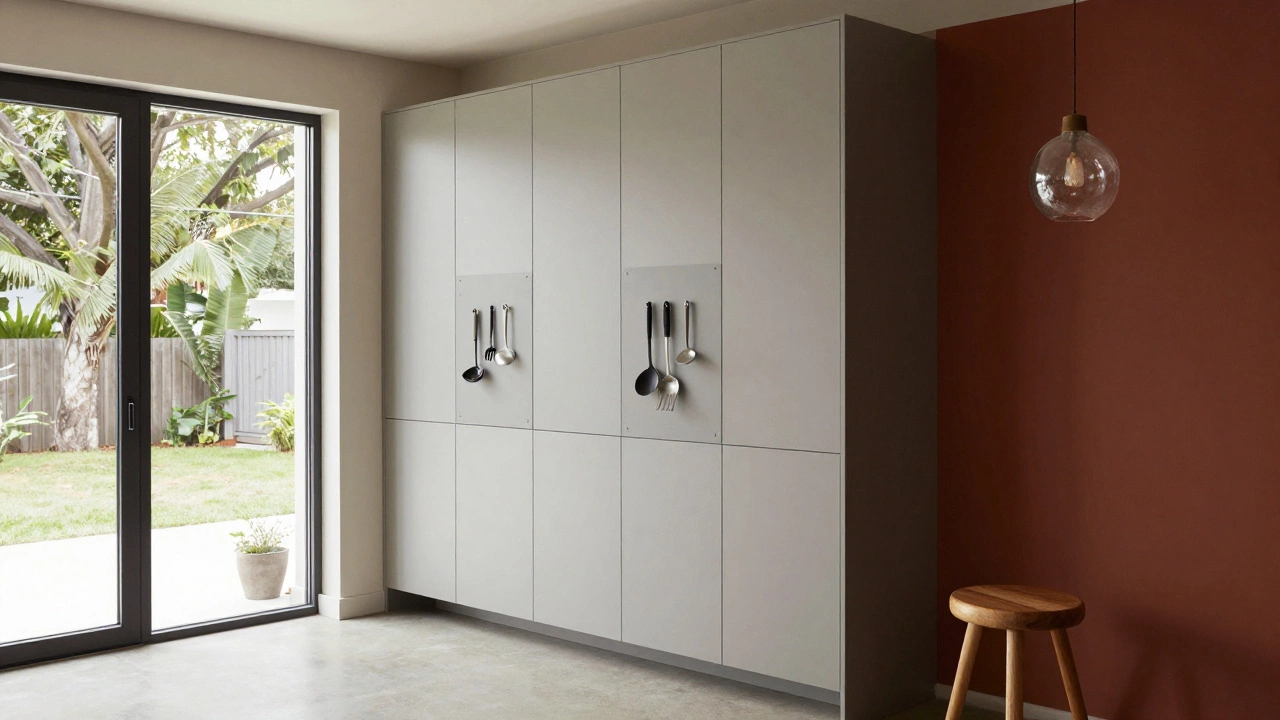
Clutter is the enemy of calm. But in 2024, no one wants to see storage either. The trend? Hidden compartments. Built-in cabinets that look like wall panels. Floating shelves that double as bookcases. Drawer systems that slide into baseboards. Even kitchens are using magnetic panels to hide knives and tools behind seamless fronts. The idea is simple: everything has a place, but nothing screams "I’m organized." It’s not about perfection. It’s about peace. A clean surface feels like a clear mind. And in homes where people work remotely, this isn’t a luxury-it’s a necessity.
Color is back-but carefully
Yes, you can still use color. But it’s not about painting an entire room teal. It’s about one bold statement: a single wall in deep terracotta, a velvet armchair in burnt sienna, or a rug with muted indigo stripes. The rule? One accent, maximum. And it’s always paired with neutral textures. This isn’t the 2010s trend of rainbow walls. It’s the quiet confidence of a single, intentional splash. Think of it like a well-placed piece of jewelry. It draws your eye, but it doesn’t shout.
Why this matters
Home decor in 2024 isn’t about keeping up. It’s about slowing down. It’s about choosing materials that age well, furniture that invites touch, and colors that don’t tire your eyes. It’s not about what looks good on Pinterest. It’s about what feels good when you walk in after a long day. The homes that stand out now aren’t the most expensive. They’re the ones that feel like they were made for real life-with all its mess, joy, and quiet moments.
What to avoid
- Overused trends like all-white kitchens with stainless steel appliances
- Matching furniture sets that look like a showroom
- Too many patterns in one room
- Lighting that’s too bright or too blue
- Buying decor just because it’s viral
The goal isn’t to copy a look. It’s to create a space that feels like you-without trying too hard.

