2026 Home Decor Color Trend Checker
Planning a home refresh? Find out if your favorite wall colors are considered outdated in 2026 and discover the on-trend alternatives recommended by interior designers.
Recommended Alternative
You walk into a friend’s living room, and something feels... off. The furniture is nice, the layout is open, but the walls scream "2018." It’s not about being cheap or ugly; it’s about color. In interior design, trends move faster than fashion weeks, and what was considered sophisticated five years ago can feel dated today. If you’re planning a refresh for your home in mid-2026, knowing which hues to avoid is just as important as knowing which ones to pick.
We’ve moved past the era of safe, neutral boxes. The current mood in home decor leans toward warmth, texture, and personality. This means several popular shades from the previous decade have lost their luster. Let’s break down exactly what colors are out of style right now, why they fell out of favor, and what you should use instead to keep your space feeling fresh and intentional.
The Death of Cold Greige
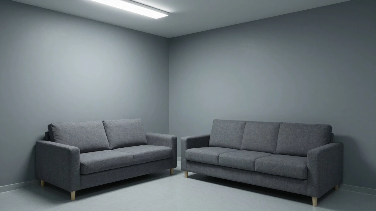
If there is one color that defined the last ten years of interior design, it is Greige, a mix of gray and beige that dominated wall choices worldwide. For years, designers pushed this shade because it felt modern yet warm enough to be inviting. But by 2024, the tide turned. Today, cold greige often reads as sterile, hospital-like, or simply tired.
Why did it fail? Because it lacks character. In a world where people are spending more time at home, we crave environments that feel like a hug, not a showroom. Gray tones, especially those with blue or green undertones, reflect light in a way that can make rooms feel chilly and uninviting. If your walls look like concrete under fluorescent lighting, it’s time to change them.
The Fix: Swap cold grays for warm whites, creamy off-whites, or even soft terracotta. These colors add depth without closing in the space. Look for paints with yellow or red undertones rather than blue or purple ones.
Over-Saturated Brights
Remember when electric blue, lime green, and hot pink were everywhere? Those high-energy, saturated colors were popular during the early 2020s as a reaction to lockdown fatigue. People wanted excitement. But now, in 2026, the trend has shifted toward calmness and grounding. Over-saturated brights can feel chaotic and visually exhausting over time.
This doesn’t mean you can’t use bold colors. It means you need to use them strategically. A single accent wall in a deep emerald or navy is still chic. But painting an entire room in neon orange? That’s a recipe for regret. The current aesthetic favors muted jewel tones-colors that have been toned down with gray or black to create richness rather than shock value.
The Fix: If you love brights, dilute them. Use sage instead of lime, dusty rose instead of hot pink, and teal instead of electric blue. Or, keep the brightness in accessories like throw pillows, art, or rugs, where you can easily swap them out if your taste changes.
Harsh Pure White
Pure white walls used to symbolize cleanliness and minimalism. Think Scandinavian chic. However, stark white can feel clinical and unforgiving, especially in homes with poor natural light. It highlights every flaw in the drywall and makes spaces feel empty rather than serene.
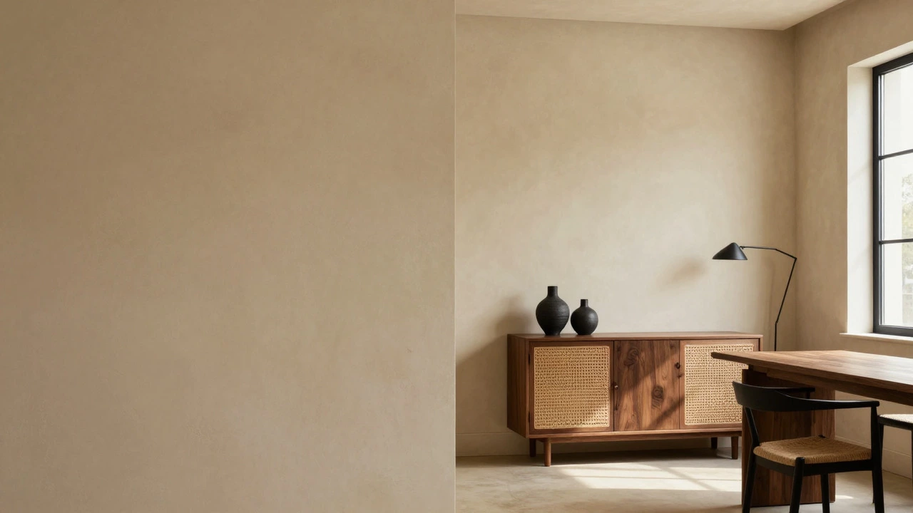
In 2026, the preference is for whites that have a bit of soul. We’re talking about whites with subtle undertones of cream, ivory, or even a hint of gray. These shades soften the light and create a more cohesive look with wood floors and natural materials. Pure white is fine for trim and ceilings, but on walls, it often lacks the warmth needed for a comfortable living environment.
The Fix: Choose "warm white" or "off-white" paints. Brands often label these as "cream," "ivory," or "linen." Test samples on your walls at different times of day to see how the undertones react to your specific lighting conditions.
Dark Moody Rooms (Without Balance)
A few years ago, dark moody interiors became a huge trend. Charcoal, deep brown, and even black walls were seen as dramatic and luxurious. While dark colors aren’t entirely out of style, the *execution* has evolved. Many homeowners went too far, creating caves that felt oppressive rather than cozy.
The issue isn’t the darkness itself; it’s the lack of balance. Dark walls need plenty of light, texture, and contrast to work. If you painted your bedroom black and didn’t invest in good lighting or light-colored textiles, the room likely feels heavy and depressing. In 2026, we’re seeing a return to lighter, airier spaces, with dark accents used sparingly for impact.
The Fix: If you love dark colors, use them on lower cabinets, window frames, or a single feature wall. Pair them with light woods, metallic finishes, and ample artificial lighting to prevent the space from feeling closed in.
Monochromatic Beige
Beige had its moment, particularly in the form of the "beige aesthetic" that swept social media. Entire rooms dressed head-to-toe in varying shades of tan and sand looked cohesive in photos but flat in real life. Without contrast or texture, monochromatic beige can feel boring and outdated.
The problem with all-beige is that it lacks visual interest. Our eyes need variation to stay engaged. When everything is the same tone, the room loses dimension. Additionally, beige can sometimes appear dirty or yellowed over time, especially in kitchens and bathrooms.
The Fix: Break up the beige with contrasting elements. Add dark wood furniture, black metal fixtures, or colorful artwork. Introduce textures like wool, linen, and rattan to give the neutral palette depth. Think of beige as a canvas, not the whole painting.
| Outdated Color | Why It Fell Out of Favor | On-Trend Alternative |
|---|---|---|
| Cold Greige | Feels sterile and hospital-like | Warm Cream or Terracotta |
| Electric Lime Green | Visually exhausting and chaotic | Sage Green or Olive |
| Stark Pure White | Clinical and highlights imperfections | Ivory or Linen White |
| All-Black Walls | Can feel oppressive without proper lighting | Charcoal Accents with Light Neutrals |
| Monochromatic Beige | Lacks contrast and visual interest | Beige with Dark Wood & Textures |
How to Choose Colors That Will Last
Avoiding outdated colors is only half the battle. You also want to choose hues that won’t feel stale in two years. Here are some principles to guide your decision-making process.
- Consider Your Lighting: Natural light changes how colors appear. North-facing rooms benefit from warm tones to counteract cool light, while south-facing rooms can handle cooler shades.
- Test Samples: Never buy paint based on a small chip. Paint large swatches on different walls and observe them morning, noon, and night.
- Think About Longevity: Bold trends come and go. Neutral bases with colorful accents are easier to update than fully painted bold rooms.
- Embrace Texture: Sometimes the issue isn’t the color but the finish. Matte paints hide imperfections better than glossy ones, and textured walls add visual interest without needing vibrant hues.
Ultimately, your home should reflect your personality, not just the latest Instagram trend. If you love a color that’s technically "out of style," own it. But if you’re looking for a timeless, inviting space, steer clear of cold grays, harsh whites, and overwhelming brights. Opt for warmth, depth, and balance instead.
Is gray really out of style in 2026?
Cold, blue-toned grays are largely out of style. However, warm grays with brown or green undertones can still work well, especially when paired with natural materials like wood and stone. The key is avoiding shades that feel sterile or industrial.
What is the most popular wall color for 2026?
Warm neutrals like cream, ivory, and soft terracotta are highly popular. Earthy greens such as sage and olive are also trending for adding a touch of nature indoors without being too bold.
Should I paint my kitchen cabinets white?
Pure white can look dated and show dirt easily. Consider off-white, cream, or even dark navy for a more contemporary look. If you prefer light cabinets, add hardware in brass or matte black to elevate the style.
Are pastel colors making a comeback?
Pastels are returning, but in muted, sophisticated forms. Think dusty blues, soft pinks, and pale yellows rather than bright candy-colored shades. They work well in bedrooms and nurseries for a calming effect.
How do I know if my current wall color is outdated?
If your walls feel cold, sterile, or overly uniform, they might be outdated. Compare your shade to current trend reports: if it’s a cold gray, stark white, or overly saturated bright, it’s likely time for a refresh. Trust your gut-if it doesn’t make you feel good, change it.