
Like most bloggers, I’ve got a fairly unhealthy Pinterest obsession, and I’ll admit right now that there have been times when I look around at our little house and it’s raggedy carpet, ugly worktops and UPVC windows and start making a long list of things to change. Pinterest is a really great resource, and it constantly supplies me with heaps of inspiration and information (particularly when it comes to enviromental issues), but I do find that if you spend too long pinning pictures of impossibly perfect homes, it can make you forget everything you love about your own home. So after a particularly long session pinning pictures of perfect Scandi homes, oak floorboards, rustic kitchens and wilderness-style gardens, rather than working out whether it’s worth replacing the worktop in a rental property, I decided to just take a few pictures to remind me of the things I love about our (very small) house.
The Conservatory (Top)
Firstly, the fact that we’ve actually got a conservatory is blessing in itself; it gives me the space to store my craft supplies in a way that makes sense and is easy to acess, and it also means that if I’m working on a photoshoot for work, I can just leave everything out rather than having to tidy away at the end of the day. It’s also the lightest room in the house, with three large windows, which means I can get some fairly decent photos even in deepest darkest winter. Admittedly, it’s basically just a plastic box stuck to the side of the house, and come November the temperature drops to pretty much sub-zero, but it’s nothing an extra jumper and a bathroom heater can’t fix!

The Bedrooms
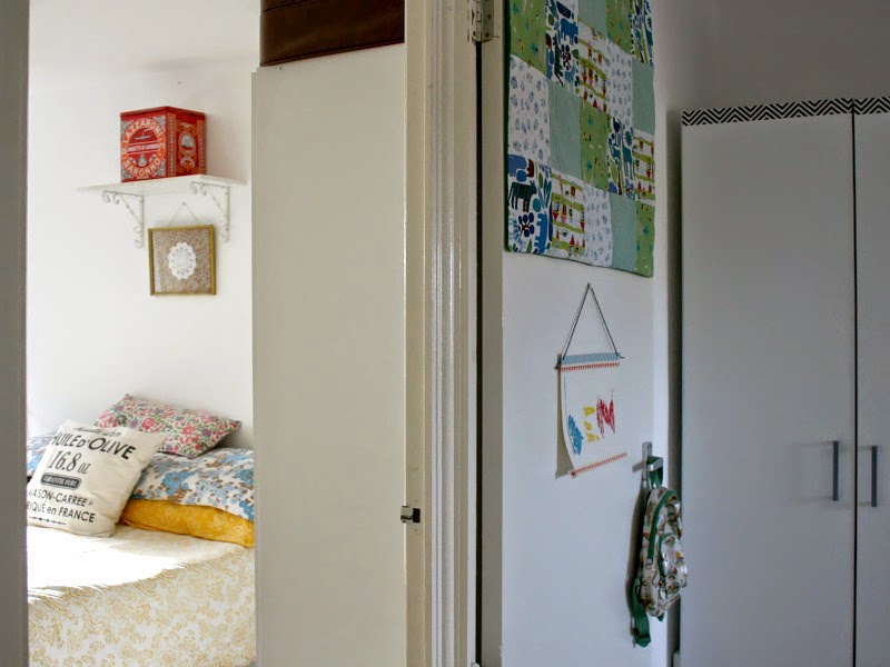
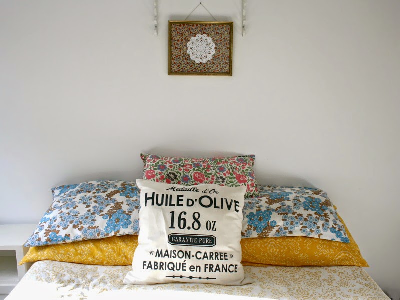
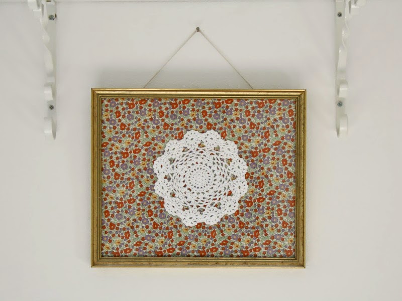
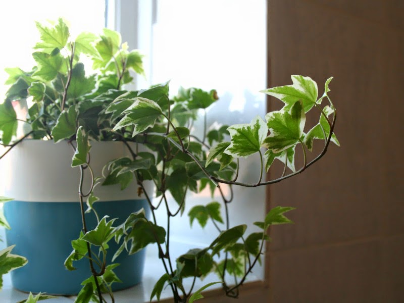
The main problem with our house is the bedrooms – not the size or shape, but the fact that there’s only two of them; early next Spring, we’re going to swap with Ben and go into the small room, while the kiddos share the big room. They’re going to have to have bunk beds, and it’s probably going to be absolute chaos – but they’re both looking forward to it, and it’s a good excuse to buy some more lovely prints and make some crafty bits. The bedrooms themselves are pretty nice; they might not be massive but they’re light and airy, and the window sills are big enough to store books and plants on; ours gets the light in the morning and Ben’s gets the sun sliding across the wall as it goes down.
The Bathroom
I did a little tour of the bathroom here, and mentioned then how small it was; it also has the worst marbled tiles (seriously, I can’t fathom why people would choose marbled over plain white) and these awful old taps. But, for all the marbled horror, it’s a relaxing little space with a really deep window sill that’s home to my (usually dying) plants and little collection of beachy finds. And if I squint, the marble effect is hardly noticeable anyway (although I’d love to rip them all off and replace it with some of those brick-effect tiles!).

The Flooring
I think out of everything in our house, the thing that gives me the hump the most is the carpet in the lounge and all the way up the stairs; I always crop it out in photographs because it’s literally just horrendous. It’s brown, brown, and there’s literally no hiding it – it makes the whole place seem darker and is just plain ugly. When we moved in, we replaced the tiles in the bathroom and kitchen, and the carpets in the bedrooms, but we’re stuck with this one; if money were no object, I’d rip it up and either replace it with bare floorboards or a more neutral carpet which is slightly less, well, ugly.

The Kitchen
The smallest, darkest, ugliest room in the house, I often wonder if I might enjoy cooking more if the kitchen wasn’t so… awful. With similar marble effect tiles to the bathroom, and one of the most horrible worktops I’ve ever seen (mottled green and brown, anyone?), pretty it ain’t. That said, it is a massive improvement on the way it was when we moved in; torn lino, cupboards with chipped paint, artex all over the walls…. it looked a little bit like one of the ‘before’ photos on Homes Under the Hammer. We plastered over the artex, replaced the flooring, painted the cupboards and took some of the doors off to make open shelving, then I added some plants, washi tape and retro crockery and pyrex. You can see the results of the makeover here, and while it’s not the best kitchen I’ve ever seen, it’s definitely not the worst either!
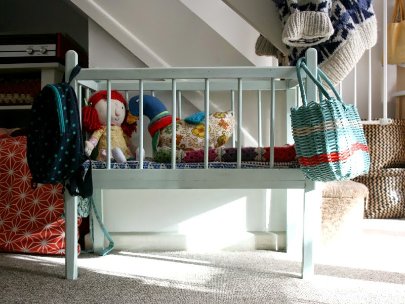


The Lounge
The lounge is probably my favourite room; it’s where I do a lot of my work, where the Husband and I watch all our box sets, where we eat dinner at our thrifted charity-shop table and where I snuggle on the sofa with some crochet or a book. It is a teeny bit dark in the winter, and that brown carpet rears it’s ugly head again, but it’s got a mantlepiece (something I’ve always wanted in a home – finally, somewhere to display my vintage bits and pieces!), and it’s a pretty good size and it just has a really lovely feel to it. It feels homely and comfortable and safe, and that’s definitely not something you can buy in a DIY store.
This is a collaborative post.

Good to focus on what we have rather than what we don't. And it certainly looks comfortable, light and homely! I linked through to the kitchen make-over and may try my hand at making those crocheted hanging pot holders.ps – I recognise the white and orange cups on your mantlepiece… That was my childhood!
Beautiful! What a lovely idea as well. I spend waaay too much time on Pinterest sometimes and it is easy to stop appreciating the beautiful things I have in my home. Thanks for the reminder! x
I love this post so much! I really try to appreciate the little things every day and it's so important to value what you have rather than constantly killing everything with comparison. Your home looks really lovely and homely. I dream of owning my own home and choosing my dream kitchen daily, but I also be sure to be thankful for the small rented flat where we live even though the kitchen will never be popular on Pinterest!
You're home is inspiring in itself. I love have a good look around it when you pop out posts like this 🙂
the goods/bads of your house sound like mine! Our conservatory is more of a greenhouse – though it does have lots of light which is fab in winter – we only have 2 bedrooms too, though Lola has one of the downstairs rooms as her bedroom… do love all the little bits in your house – it looks beautiful x
Our house is tiny and we have brown carpet going up our stairs which I hate too! You are right though, I think it's good to stop and find things you do like, I'm feeling quite cosy in mine at the moment and don't mind it so much. We only have two rooms and swapped so the kids have the big one and we have the small one. Although I did contemplate swapping back yesterday as our one is so small! x
I can't tell you how much I enjoyed this post. I love looking around your home. There is so much that inspires. I feel like I'm flipping through a magazine of how I want my house to look! I can identify with the horrible carpet. Ours, though relatively new, is a horrible brown colour. The last owners put it in. We won't have the money to change it for a long time yet. We also have a dark livingroom, which really gets to me. Ah well. Lots to love here too.
Lovely pics! Your house looks really loved and thought about and I love the vintage pieces. I know how pinterest can sometimes get you a bit down about your own space, I defiantly get pin envy from time to time x
I adore Pinterest and I am also a complete magazine junkie, I really love absorbing all the inspirational/aspirational ideas from both of them… BUT to be honest, my 1940s very square family home is only just starting to flourish into something I really want it to be!I finally have a kitchen and bathroom that make the most of the space and the light after the last ones being there for 30 years, and I'm loving it, but I've also come to appreciate these things take time…a LOT of time, so am pacing myself before I beat myself up about the rest of the house (which now looks even more tired compared to the new rooms!) It'll get there! Houses never seem to be 'done', we're always looking to the next project!
Absolutely love your honesty here! So often it's blogs which have Pinterest-stylised homes that make me feel bad about mine but personally i'd rather have a house that looks lived in than looking like a show room! Love all the personal touches you have framed :)Karen x
I love looking at shots of your home, I love all the colour and the vintage pieces. Little jealous about your conservatory, our house is victorian and too be honest the lighting is terrible, even in the summer! x
I know just what you mean about Pinterest – it's so inspiring but I also start realising how much I still need to do with our own house. I think your home looks so beautiful and I am always inspired by your mix of prints and fabrics. Sounds like an exciting time for the kiddos as well – bunk beds – my son would love the idea of thatLaura x
I love taking a peek inside homes and seeing all their treasures, and although you're hating I n your carpet etc you've gone a great job of giving it it's own personality. I would love to change our carpets and kitchen too ! X
No place like home and yours is lovely. I use Pinterest like a relaxation session and try to keep it all very much in perspective!!